


What's going on with US jobs data
Five charts to start your day


Good morning – here are your five chart for the day.
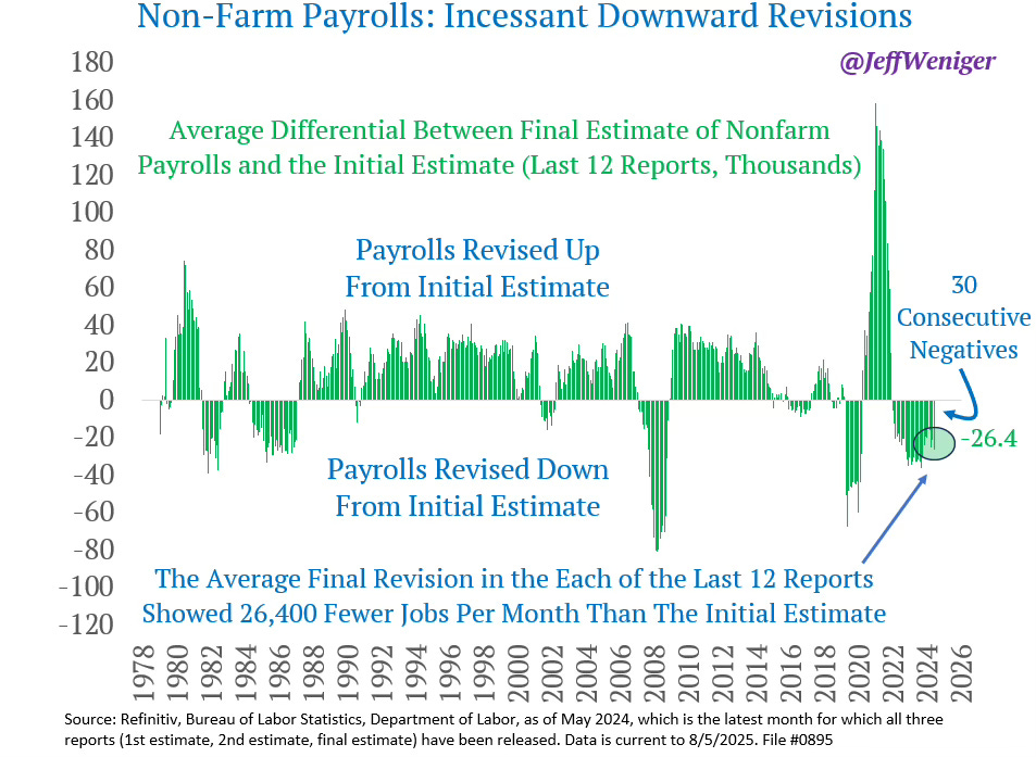
Two weeks ago, I wrote about the firing of Dr Erika McEntarfer, Commissioner of the US Bureau of Labor Statistics, hours after Friday's dismal jobs report. Trump's decision to terminate a Senate-confirmed official (86-8 vote) for delivering unwelcome data represents a watershed moment for American economic statistics. Today's lead chart shows exactly why the messenger was shot.
CHART 1 • What's going on with US jobs data
The US added just 73,000 jobs in July, missing expectations of 100,000. But the real shock came in the revisions: May and June were slashed by a combined 258,000 jobs, marking the steepest two-month downward revision on record outside the pandemic. The three-month average collapsed to 35,000 – less than one-third the pace of a year ago.
Trump's response? Fire the commissioner and claim, without evidence, that the numbers were "rigged". Here's the reality: revisions are normal. Early job reports rely on large firms that respond quickly. Smaller businesses report later, and they're the ones suffering most. When their data arrives, numbers get revised down. That's statistics, not conspiracy.
The underlying data is grim. Health care and social assistance accounted for 94% of July's job growth. Average weeks unemployed hit 24.1, the highest since April 2022. The US economy has just slowed, and the jobs numbers reflect this.
Source: Jeff Weniger
Want the other four? Become a paid subscriber.
Keep reading with a 7-day free trial
Subscribe to Killer Charts to keep reading this post and get 7 days of free access to the full post archives.