


US stocks close the gap with Europe
Five charts to start your day


Good morning – here are your five chart for the day. Each one comes snap stat, quick take and why it matters. Skim, steal, forward (but always credit!!).
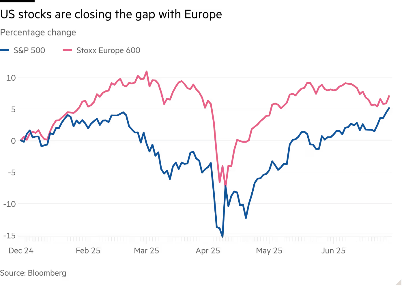
CHART 1 • US vs European Stock Performance Gap Closes
One of the most dramatic turnarounds in global equity markets is unfolding right before our eyes. After Europe dominated early 2025 with the Stoxx 600 massively outperforming the S&P 500, US stocks have staged a blistering comeback that's almost completely closed the performance gap. The chart below shows US stocks (blue line) surging from deep negative territory to nearly match European performance (pink line) by late June.
This reversal defies conventional wisdom that had Wall Street analysts proclaiming the end of US equity exceptionalism. While Europe started the year with its strongest performance versus America since 2000 – driven by ECB rate cuts and Ukraine peace hopes – US markets found their footing as key factors aligned.
What makes this comeback impressive is the speed. In just months, US stocks erased what looked like an insurmountable European advantage, proving reports of American market dominance were greatly exaggerated. However, it worth noting that the same story isn’t being narrated in the bond more. There still appears to be a significant rotation out of US Treasuries into euro-denominated government debt, especially at the long end of the yield curve.
Snap stat – US stocks erased a 15+ percentage point deficit to nearly match European performance by June year-to-date
Quick take – America's market resilience shines as early European euphoria fades to reality
Why it matters – US equity dominance proves surprisingly durable despite mounting structural challenges
Steal-this-caption – "Never bet against America – the comeback kid strikes again"
Source: Financial Times
Want the other four? Become a paid subscriber.
Keep reading with a 7-day free trial
Subscribe to Killer Charts to keep reading this post and get 7 days of free access to the full post archives.