


Creating a racing bar chart of the world's richest people

So this is going to be my first step-by-step tutorial on how to make a data visualisation using JavaScript. This is not an easy tutorial to follow if you have no coding experience. If you have never use JavaScript before then I suggest you do a course on the basics first before trying to follow this tutorial as it might be a little overwhelming.
You will need to be a paid subscriber to follow this. I can’t give away all my work for free. I hope you understand.
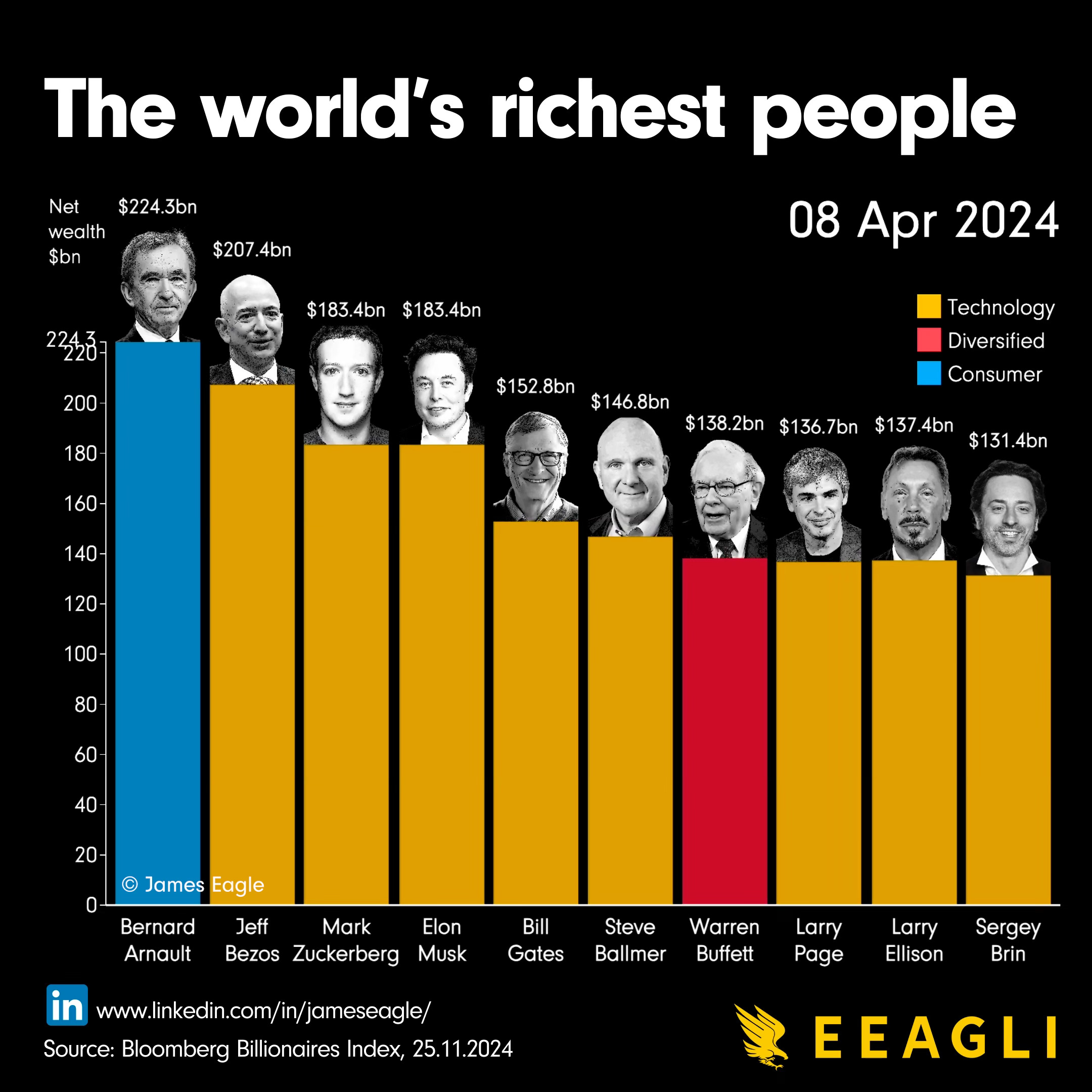
This is what we are aiming to create, which is what I published on LinkedIn.
Keep reading with a 7-day free trial
Subscribe to Killer Charts to keep reading this post and get 7 days of free access to the full post archives.